Excel beginners are often hesitant about how to handle the graduation of the horizontal axis of their chart when it comes to numeric values.
Reminder: axes of the graph
- A graphic is the image representation of data entered in a pinboard.
- The elements of the graph are identified by a horizontal axis, that of abscissa, and a vertical axis, that of ordered.
- These ordinates must be numerical values (numbers, hours, dates, percentages).
Textual abscissa
Usually, the x-coordinates are textual data (city, name, category ...). In this case, the axis labels reflect this data. No intervention is required, other than to select the data of the 2 columns, that is to say A2: B10 in our example.
No abscissa defined
When it happens that the data table is reduced to a single column, Excel considers that column as the series of ordinates.
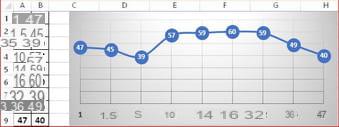
The software then automatically creates a decimal graduation for the x-coordinates: 1 2 3 4 ...
Defined abscissa
- Default :
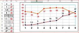
If the data table consists of two number columns, Excel assumes there are two series and draws two curves.
As indicated above, a decimal graduation is created for the x-coordinates.
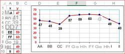
- Respect for values :
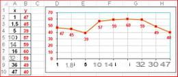
To obtain abscissas showing the numerical values of column A, use the "Select data" window:
=> delete series 1 (column A)
=> modify the labels of the horizontal axis by selecting A2: A10.
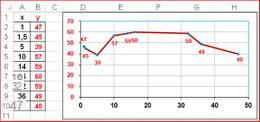
- Regular intervals :
To obtain a graduation of the abscissas with regular intervals, it is necessary to use the type of chart with A cloud of dots,
excluding any other type.
Customization
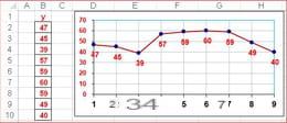
- The best thing is to have both a regular graduation AND the display of the values of x.
- We owe this technique to ccm81, which inspired this practical sheet https://forums.Idroid.com/forum/affich-36748093-abscisses-graphique-excel#10
- The trick is to add series consisting of zero values, which will therefore merge with the horizontal axis, and choose from among the Label options, the contents "X value"instead of the default content" Value Y "...
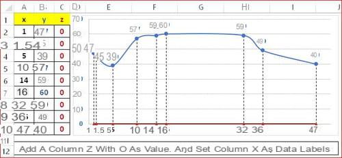
- NB In a point cloud type chart, we cannot put text type labels (at least with Excel 2003). The solution then goes through a (very small) macro; consult the Excel file of ccm81 : https://mon-partage.com/f/z80kMUWV/