After months of testing, Spotify is modifying its desktop application. On the program for this update: a whole new look copied to the mobile application, playlists that are easier to build, and more offline.
Teleworkers who work with Spotify in the background may have noticed. This Thursday, March 25, the music streaming giant changed the design of its desktop application on PC and Mac, as well as its web player. This is not an update, the design chosen should determine what Spotify will look like for "years to come", explains the brand on its site.
“We are constantly releasing new features, optimizing our services for new devices and always looking for ways to expand our offering,” the Swedish company says. “And yet, along the way, we felt our desktop app experience just didn't hold up anymore, and it was time to change it. "
To learn more
At 5 euros, this mobile plan offers just the right amount of data
As the desktop experience was originally their first way to introduce Spotify to the world, the brand says it has not taken the task lightly. The press release speaks of "months of work" on this new version.
The main objective of this “improved look and feel”: “aligning the desktop experience” with that offered to smartphones. While doing so, Spotify sought to create a "coherent" design, thereby understanding a design that would be effectively declined between the different versions.
New look
The bulk of the work is therefore based on the look and the interface. The "search" button is found on the left of the screen, in the form of a heading, between the reception and your library. This division will not completely lose mobile users, who are already used to it.
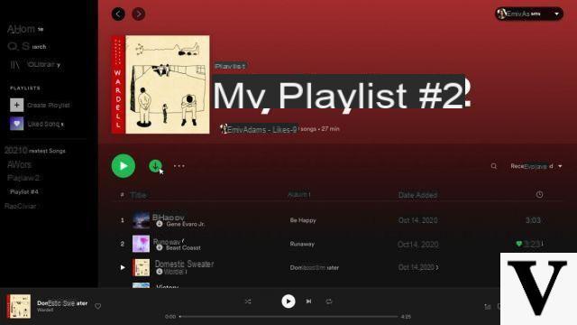
The second big change is on your profile. Now Spotify will show your favorite artists and songs for the month. Finally, you will now be able to launch a “radio session linked to a title” or an artist from the menu that appears to the right of the title where your mouse passes.
Spotify changes its interface // Source: Spotify
Easy playlists creation and listening
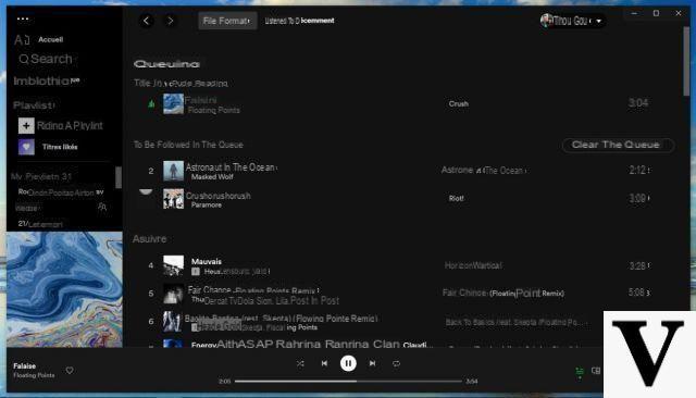
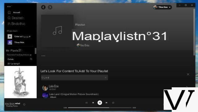
Good news for all playlist freaks. Spotify has revised some details of the presentation and navigation in these. First, when you open a new playlist now, a search bar appears directly to find other titles. Convenient.
The operation of Spotify playlists has been reviewed // Source: Spotify
Another improvement taken directly from the mobile application, it will again be possible to edit queued songs and access recently listened songs. The library also inherits a new drop-down menu that allows it to be sorted according to various criteria: recently listened to, recently added, etc. The drag and drop of titles directly in a playlist has also been revised.
Enhanced download for offline listening
Finally, for premium users, on the desktop application, it was until now possible to download songs once placed in a playlist. Now, albums, podcasts and tracks can be downloaded directly to be listened to offline.
 Spotify vs Deezer vs Apple Music…: which music streaming service to choose?

You hesitate between Spotify, Deezer or Apple Music? Wondering what are the interests of Qobuz, YouTube Music or Tidal? We help you choose the best streaming service according to your…