Our video
Loading your "FAQ: Editing a chart" videoAfter creating a chart, it is common to want to add information or modify certain elements. It is possible to manipulate almost any element of the chart or to add elements. If you created an embedded chart, you can turn it into a stand-alone chart on a stand-alone chart sheet.
The information in a new chart should almost always be changed to suit your needs.
MOVING AND CHANGING THE SIZE OF AN EMBEDDED GRAPHIC
After it's created, you may need to move or change the size of an embedded chart to better fit it on the spreadsheet.
To resize an embedded graphic, you click on it. Resize handles appear around the chart. When you point to one of the handles, the pointer changes to a double arrow indicating the direction of the possible resizing. You make the graph larger by pulling outward and you reduce it by pulling inward. While resizing, the spreadsheet displays a guide rectangle that indicates the new size of the chart. 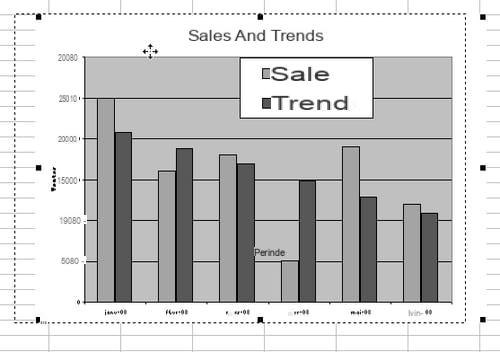
You can also consider that the chart could be embedded in another location: elsewhere on the same worksheet, in another worksheet, or even in a separate chart sheet. Several methods are possible:
- Select the chart, copy it to the Clipboard by pressing CTRL + C or choosing Edit> Copy from the menu bar, select the new starting cell in the worksheet and paste the chart by CTRL + V or by choosing Edit> Paste.
- Select the graphic to reveal the selection handles. Be sure to select the entire chart (the tooltip indicates that this is the chart area), not just one of its elements. Then drag the graphic and drop it in the new location.
- To move the chart to a separate chart sheet (Excel only), select the chart and choose Chart menu> Location to open the corresponding dialog box. You have the options On a new sheet and As object in. This last option opens the list of worksheets in the current workbook.
SELECT ELEMENTS OF A GRAPHIC TO MODIFY THEM
It is common to have to modify certain elements of a graphic: delete certain information, add text boxes, modify the thickness and color of the lines, etc. The most efficient is to start by selecting the graph (a single click with Excel, a double click with Calc). By moving the pointer on the graph, tooltips provide information on the different objects on the graph. To select the desired item, click on it. 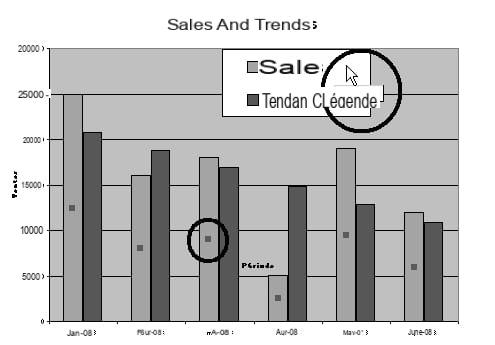
Objects, like data series, are grouped. Clicking on one of them selects the whole group. If you need to edit only one of the objects in the series, click that object again to select it individually. Do not double click. Click once to select the group, wait a moment and then click again on the desired item.
The Graph toolbar is useful when you want to modify a graph. Its content differs depending on the software used. Relevant buttons are automatically displayed with Calc. 
With Excel, if it is not displayed, right click on another toolbar and select it from the context menu. The following table shows typical commands on the Graph toolbar.
The elements of the Graph toolbar
| Commands common to Excel and Calc | |
|---|---|
| Name | Description |
| Legend / Show hide legend | Show or hide the chart legend |
| Chart type / chart type | Displays the palette of different types of charts. The button design may change according to the last type of graphic activated |
| By row / Data in series | Display of data in rows |
| By column / data in columns | Displaying data in columns |
| Excel-specific commands | |
| Name | Description |
| Chart objects | Opens the drop-down list of chart objects. Select the desired item from the list |
| Format… | Opens the Format dialog box for the selected object. The tooltip changes depending on the object |
| Data table | Show or hide data under the x-axis (X) |
| Fold text down | Modifies the inclination of the text of the axes, labels, etc. by 45 ° downwards |
| Fold text up | Modifies the inclination of the text of axes, labels, etc. by 45 ° upwards |
| Calc specific commands | |
| Show / hide title | Display or not the title of the graph |
| Show / hide axis title | Display or not the axis titles |
| Show / hide axes | Display or not the axes |
| Show / hide horizontal grid | Display or not the horizontal grid |
| Show / hide vertical grid | Display or not the vertical grid |
| Autoformat | Reopen the Assistant and allow you to change all settings |
| Text scale | Automatically changes the font size when changing the size of the chart |
| Reorganization of the diagram | Places all diagram objects in their default position. This function does not modify the type of the diagram or any of its attributes, except the position of the objects. |
CHANGING THE TYPE OF GRAPHIC
Even after spending some time developing a graph, the result may not meet your expectations. It is very easy to change the type of chart to choose one that better suits your aspirations. It is even possible to combine different types of graphics. When comparing data series in a graph, it can be useful to distinguish them by showing one series as a histogram and the other as a line. The comparison is thus much clearer.
Calc requires you to modify the entire graph, choosing the appropriate subtype, while Excel allows you to modify only one element. You can therefore proceed as follows to change the type of a chart:
- Click the Chart Type / Chart Type button on the Chart toolbar and choose a new type from the palette.
- Right-click on a series (or anywhere in the graph to modify the graph as a whole) and activate the Type of graph / Type of graph command from the context menu to open the dialog box. Make the desired changes.
- Click the Chart Wizard button on the Standard (Excel) or Rearrange Chart (Calc) toolbar. Choose a new chart type and subtype, and click the End / Create button. This technique changes the whole graph, not just a series of data.
- With Excel only, choose Chart> Chart Type to open the dialog box with the same name. Then choose a type and a subtype.
MODIFICATION OF DATA SERIES
A data series is represented by bars in a bar chart or by columns in a histogram, etc. In a histogram, columns of the same color represent a series of data.
You can easily add or remove series in a chart.
Select a data series in a chart
Click on one of the data (a column, a bar, etc.) in the series. You notice the following three things:
- When you point to a series, a tooltip informs you about the nature of the series and displays the data concerned.
- When you click on a data, the whole of the series is selected and the selection is symbolized by a small square in each data of the series.
- When a series is selected, the corresponding data in the worksheet is surrounded by a blue border.
Remove a series from the chart
When building a chart, you often want to analyze information with and without certain data. When comparing forecasts and actuals, you may need to present only one or the other data, for example. To remove a series from an Excel chart, select it and press the DEL key, or choose Edit> Clear> Series from the menu bar. With Calc, you must change the range affected by the graph.
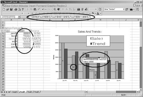
Modify source data by adding a series
Over time, you will sometimes need to add series to a chart to reflect changing information. You can create another chart or prefer to add the new data to the existing chart.
The method of adding data to a chart differs between spreadsheets. Excel is more flexible in this respect than Calc.
Either way, start by modifying the source data as needed. Then, with Excel:
= Select the graph and choose in the menu Graph> Add data to open the dialog box of the same name. You specify the range of cells you want to add. You can use the collapse button to minimize the dialog box, or move it around to get a better view of your worksheet. This is a very convenient method of adding data from another worksheet. 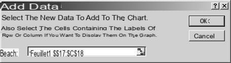
Copy the data, select the chart, and paste the data into it. You can use the Paste command from the contextual menu, the Edit> Paste command, the Paste button on the Standard toolbar as well as the keyboard shortcut CTRL + V.
- If you want to have better control over how Excel pastes data, use the Edit> Paste Special command to open the corresponding dialog box.
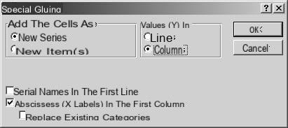
- The Paste Special dialog box provides the following options:
· New series: adds the selected data as a new data series.
· New point (s): adds the selected data as a series on the same axis.
· Rows or Columns: creates a series with the selected data in rows or columns.
· Abscissas (X labels) in the first row: uses the first row or column of the copied data as the label of the series.
· Series name in first column: uses the first row or column of the copied data as the label for the x-axis.
· Replace existing categories: replaces the labels of the existing categories with those of the selected data. You can, for example, replace the labels for January through December with 1 through 12.
You can also insert the new data into the graph by simply dragging and dropping. If the data is from a worksheet other than the one where the chart is embedded, hold down the ALT key as you drag the data to the tab of the sheet with the chart. When this sheet is activated, release the ALT key and drop the data into the graph. If the data is in another workbook, open the relevant workbook and activate the Window and Reorder command to display both workbooks on the screen. View the worksheet that contains the data and the worksheet that contains the chart. Select the data and drag it into the graph. Such a collage between two workbooks generates a link between these two workbooks.
With Calc, you either need to reopen the wizard by clicking Reorganize Chart, create a new chart, or use the drag and drop technique but select all of the chart's source data. Only the source data is then modified, the other parameters of the graph remaining unchanged.
Resize the plot area
You can change the dimensions of the plot area to balance the graphic or on the contrary amplify the visual effects.
MODIFICATIONS POSSIBLE ONLY WITH EXCEL
The following modifications are possible with Excel, but not with Calc. If you have another spreadsheet, consult its documentation.
Modify axis scales
Scaling the axes in a graph can influence its visual characteristics. You can play on the scale of the axes to accentuate certain contrasts, modify the location of the intersection of the axes (the origin), define the maximum value and the interval between the values.
To change the settings for an axis, select it in the chart, right-click and choose Format Axis, then click the Scale tab.
This window, whose appearance depends on the selected axis, allows you to modify several interesting parameters. We will start with the Y axis (ordinates). 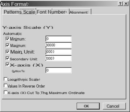
As you can see, all the options are in principle currently checked, which means that Excel is in "automatic scale" mode. Clear the check box corresponding to the value you want to specify, which can be the maximum value, minimum value, primary unit, and secondary unit.
You can also specify where the Y axis intersects the X axis and whether to use a logarithmic scale.
TO KNOW
If you check the Logarithmic scale option, the default origin is 1, minimum, maximum, primary unit and secondary unit are calculated in powers of 10, depending on the data range.
Finally, you can choose to display the values in reverse order, which is sometimes of interest.
The X-axis (abscissa) dialog box also offers various possibilities, depending on the type of the values. You can at least modify the location of its intersection with the y-axis, the number of abscissas between the labels and the graduation marks as well as put the abscissa in reverse order. 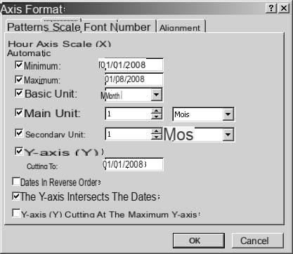
Add a trendline to a series
Adding a trend curve makes it possible to follow certain evolutions. With regression analysis, you can set a trend and make projections. Of course, you could construct such a curve yourself by creating a series with a formula with the appropriate functions, but the task is not easy if you are not familiar with statistics!
However, trendlines are only available for certain types of charts: histograms, areas, lines, bars, and scatterplots.
To add a trendline, do the following:
- Select the chart or series.
- Choose Graph menu bar> Add Trendline to open the Insert Trendline dialog box.
- Choose the type of curve in the Type tab.
- Click on OK.
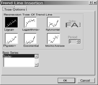
The following table summarizes the types of curves available in the dialog box. You can learn more about regression analysis and its equations in Excel Help.
Trend curves
Type Action
Linear Inserts the least squares line of equation: y = mx + bm being the slope and b the y-intercept
Logarithmic Inserts the least squares curve of the equation points: y = c ln x + bc and b being constants and In the function of the natural logarithm
Polynomial Insert the least squares curve of the points according to the equation: y = b + c1x + c2x2 + c3x3 +… + c6x6b and c1… c6 being constants
Power Calculates the least squares curve of equation: y = cxbc and b being constants
Exponential Calculates the least squares curve of the equation points: y = cebxc and b being constants and e the base of the natural logarithm
Moving Average Inserts a moving average curve. The number of points in a moving average is equal to the number of values in the series, minus the number specified for the period
Order By entering a number in the field, you specify the highest polynomial order. The value is an integer between 2 and 6
Period The value entered in this field corresponds to the number of periods to be taken into account for the calculation of the moving average
Base series To select the series concerned by the trend curve
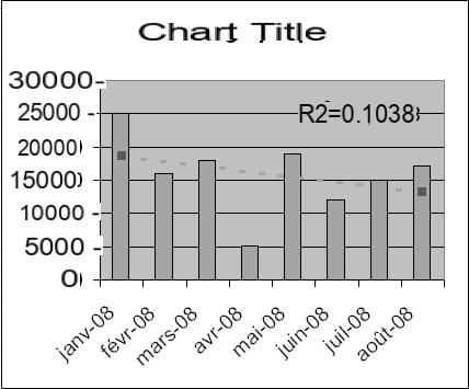
In general, it is always best to format a trendline to improve the presentation of the graph. It is for example judicious to use dotted lines which indicate more a forecast, than solid lines which rather refer to a reality. Likewise, by default, trendlines are not the same color as the data series they accompany. Better to harmonize them so that the reader understands more directly the relation between the curve and the series. This will make any further explanation superfluous.
To format a growth chart, select the chart and double-click the trendline. The dialog box that opens allows you to make the usual format changes, but also offers an interesting Options tab, with the following settings:
- Name of the trend curve: to specify whether Excel automatically gives a name to the curve or if you choose it.
- Forecast: to define the number of periods prospectively or retrospectively.
- Cross the horizontal (X) axis at: to specify where the trendline should meet the axis.
- Display the equation on the graph and Display the coefficient of determination (R²) on the graph: to display the corresponding information in the graph. If you are developing different trend scenarios, it may be useful to display the values for them.
Delete a chart
Deleting a chart and starting all over is sometimes easier than correcting it: you click on End (or on Create), you realize that you did not choose the right options or that you should have made more details in the Assistant. However, you cannot undo the insertion of a graphic. But if the graphic is still selected, you just need to press the DELETE key to destroy it. If the chart is on a separate chart sheet, delete the sheet, and start over from the beginning.
Another solution is to select the chart (if it is not anymore) and re-enable the Chart Wizard. You modify or complete your options and click on Finish (or Create).