Want to make your Excel tables more attractive? Use line charts to quickly visualize the evolution of a series of data.
A little drawing sometimes says more than a big speech. This popular maxim is especially true when dealing with a mass of quantified data, as is often the case with Excel tables. And rather than immersing yourself in a hard-to-digest matrix of numbers, it's more enjoyable to examine a graph, especially when it comes to analyzing changing data.
Of course, Excel has a function allowing you to transform tables into graphs. This completely configurable tool can be very useful if you know how to master it. In addition, its appearance is customizable, which makes it easy to differentiate several data fields.
How to insert line chart in Excel?
In Excel, it is very easy to create a line chart from a selection of cells in a worksheet.
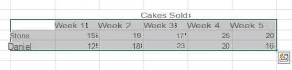
- Open the workbook for which you want to create a line chart and select the set of cells with the data to use, including description cells, as in the example below.
- Click on the tab Insertion and click on the icon Insert a line chart in the Graphics section.
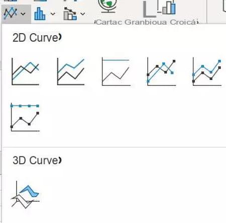
- Choose the template you want to use.
-
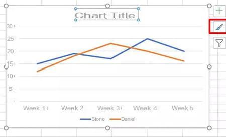
The chart will then be integrated into the workbook, with straight lines corresponding to each data point.
How to customize a line chart in Excel?
To change the title of the chart, click on it and enter the new title.
- To change the style of the chart, click on it. Then click on brush in the three icons on the right then select the style you want.
- To change the appearance of an element (color, line thickness and style, border, etc.), double click on it.
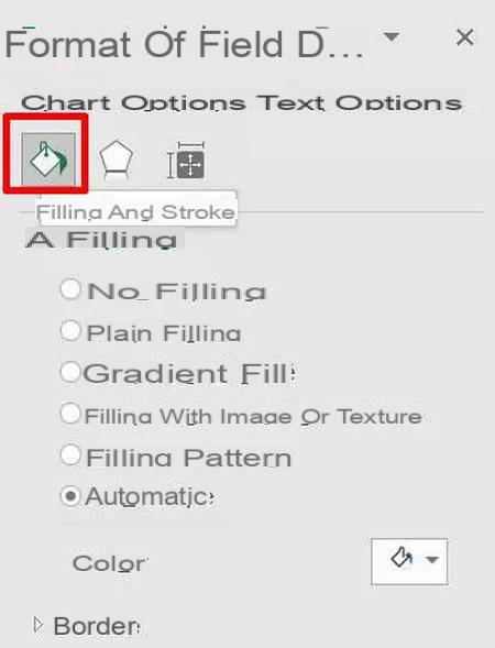
- In the Formatting window that appears on the left, select Fill and strokes by clicking on the paint bucket icon.
- Choose the styles and colors you want. The change will be automatic.
How to smooth a curve in Excel?
You can also choose to smooth the curves of your graph.
- To smooth a curve, double-click on this one.
- In the Formatting window that appears on the left, select Fill & Lines.
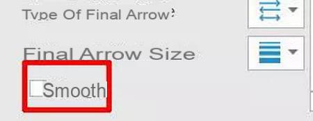
- At the very bottom of the window, check the box smooth. The curve is automatically smoothed!